Font choices and connotations
It is important to choose the correct font when thinking about the titles in an opening title sequence, as it can really effect the atmosphere of a horror film. It can change a terrifying sequence into a laughing stock if the wrong font is chosen.
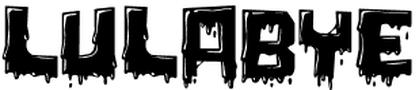
This font is not effective as the blood dripping from it is incredibly cheesy. It is difficult to read and would not reflect the genre we are hoping to replicate in our opening title sequence.
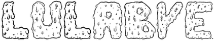
Similar to the first font, this font is difficult to read and is also very funny looking. According to dafont.com, this font is meant to be "horrifying." however, it's the kind of font you might expect to see in a children's film.
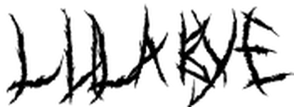
This font is also labeled under "horror." It is even harder to read than the first two fonts. We will be sure to never use this font in our opening title sequence, as it is unclear, cheesy and would not reflect the genre we are trying to recreate in our opening title sequence.
Timeline of Examples
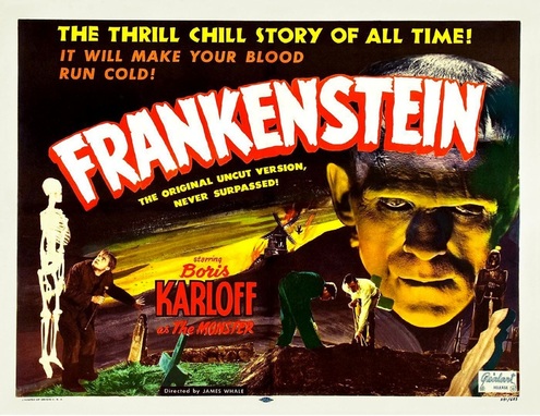
1931 - Frankenstein
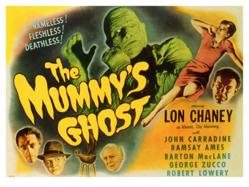
1944 - The Mummy's Ghost
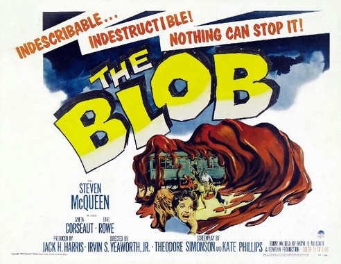
1958 - The Blob
1960 - House of Fright
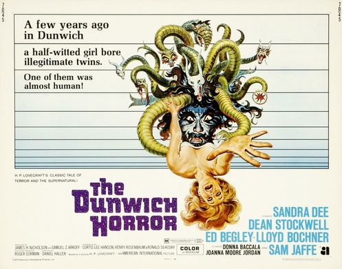
1970 - The Dunwich Horror
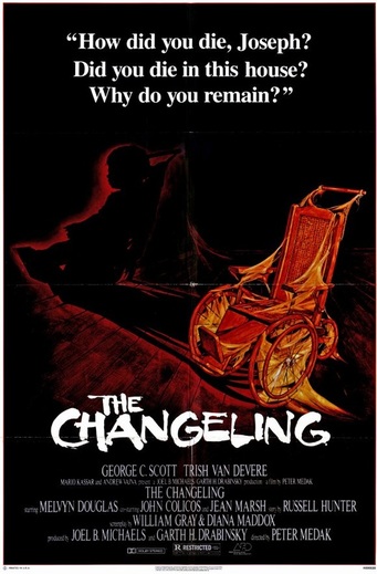
1980 - The changeling
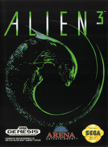
1992 - Alien 3
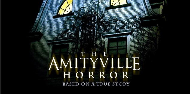
2005 - The Amityville Horror
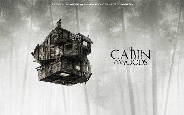
2012 - The Cabin in The Woods
Conclusion
As horror films have progressed through the ages, the titles have got simpler and clearer. This makes them look more professional and serious compared to older horrors such as Frankenstein. Therefore we think it would be a good idea to use a simple font as we want our opening title sequence to look modern and serious.
Other Modern titles
Looking at successful, modern titles such as The Last Exorcism - 2013, Sinister - 2012 and Let Me In - 2010, we have decided to use the same font, Times New Roman, for our titles as it is clear and simple. We may add an effect to give it a "horrifying" look, but we do not want our titles to look cheesy or old-fashioned. The point of our OTS is to make people scared, not laugh.
Our Title
We looked at the modern horror films above when deciding what we wanted our title to look like. We specifically wanted our title to look quite simple and certainly not cheesy.
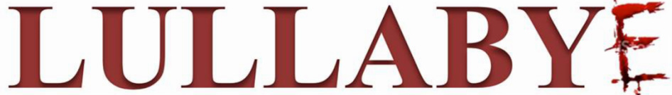
This is our initial title idea. We thought it would be effective to have the "E"scratched in as it gives another dimension to our title and may also intrigue the audience.
We decided to use Times New Roman for the majority of our title, as it is considered "safe" as it is used in every day life (Newspapers, Books, Posters etc)
Our group chose to use a dark red against a white background, as the white makes the red stand out. It is also the colour of blood, making it obvious that the film is meant to be a horror.
Many people also get queasy at the sight of blood, so hopefully the colour will start to make people think of it as we want to appeal to the masochistic side of our audience.
(SC)
